Popups
Open “Popups” in the sidebar and click “Create popup”. Flowtomate creates a draft and opens the editor. Its steps are “Content”, “Display”, “Audience”, and “Review”.
Access and permissions
Viewing the list requires “View” in the “Popups” row. Creating a draft requires “Create”; saving, publishing, and changing status require “Edit”. The account owner has all permissions.
Content
Enter a name your team can recognize in “Internal name”. It appears in the popup list and detail view, but visitors do not see it.
Choose “Blank popup” to build a layout from scratch, or one of 13 templates: “Feature announcement”, “New module”, “Video demo”, “Onboarding”, “Survey”, “Maintenance”, “Plan upgrade”, “Webinar”, “Product feedback”, “Discount”, “Release notes”, “Security”, and “Welcome”. The template is applied immediately; you can then edit it like any other layout.
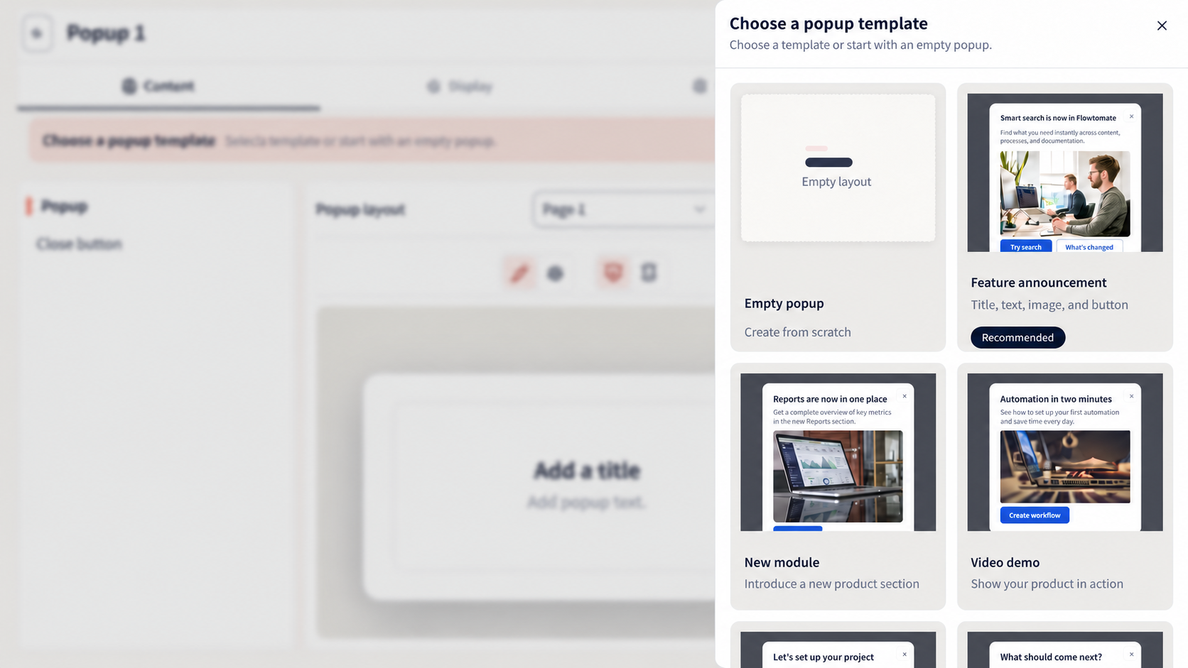
The template catalog in a sample project. You can edit the selected template in the builder.
For a blank popup, first add a row with one, two, or three placeholders. Drag the required element into an empty placeholder: “Heading”, “Text”, “Image”, “Video”, “Buttons”, “Survey form”, or “Multi-step survey”. For an image, specify a URL and “Alt text”; for a video, specify the video URL and, optionally, a “Poster”.
Select a row to set “Column proportions”. Two-column layouts offer “Wide column right”, “Equal columns”, and “Wide column left”; three-column layouts offer “Wide column right”, “Wide column centered”, “Medium column centered”, “Equal columns”, and “Wide column left”.
Select an element on the canvas or in the “Element tree” to open its settings. You can drag rows and elements, move them with the arrows, duplicate them, and delete them. Buttons can open a link or another popup, submit a form, go to the next, previous, or selected page, or jump to a block on the current page. “Survey form” collects answers in a form, while “Multi-step survey” shows one question per page.
Click “Add page” to create a flow with several pages. In “Page actions”, you can duplicate, rename, move, set a page as the start page, or delete it. Link pages using the button actions “Next page”, “Previous page”, or “Specific page”.
“Undo” and “Redo” are available at the top of the builder. Switch between “Edit” and “Preview”, and between “Desktop” and “Mobile”, to configure and check both layouts. Settings for the selected element and the popup itself apply to the selected device.
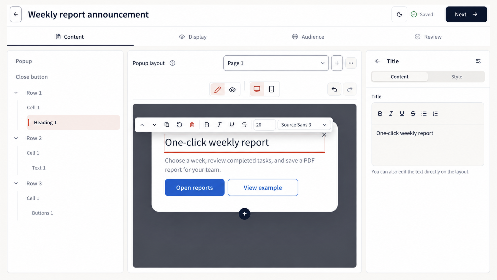
A saved draft of a sample popup. This screenshot does not verify external actions or display on the website.
Display
In the “Display” step, enable one or more conditions under “1. When to open the popup”. Any enabled condition is sufficient:
- “Time on page” — time spent on the current page;
- “Time on site” — total time spent on the website's pages;
- “Pages viewed” — the number of pages during the current visit;
- “Page scroll” — the page scroll percentage;
- “Exit intent” — for a mouse or trackpad;
- “Element click” — a click on an element found by a CSS selector;
- “From site code” — manual opening through the widget.
For manual opening, enable “From site code” and give the developer the “Popup ID” or copy the “Command”. The call and its conditions are described in the manual launch reference.
Under “Schedule and limits”, choose “Immediately after activation” or “On a schedule”. For a schedule, set “Start”, optionally “End”, and “Time zone”. “Daily limit” and “Lifetime limit” restrict the number of impressions per visitor: the first per local day, the second over all time.
Under “After interaction”, choose separate rules for “After close” and “After goal action”: “Show again after” the required number of days, or “Never show again”.
Audience
Without rules, the popup is available to all visitors with the widget. Click “Add rule” to limit the audience by URL, device, geography (“Country”, “Region”, or “City”), visitor attribute, or event. A cookie or URL parameter rule requires you to configure passing that value; if the data is missing, the rule will not match. Pass attributes to the widget when identifying the visitor. For URLs, you can use * to replace any part of the value.
All rules are joined with AND: the visitor must meet every rule. Open a rule and choose the source, field or key, “Operator”, and value. Available operators depend on the source: “equals”, “contains”, “starts with”, “exists”, and “is one of”. For an event rule, select the “Event ID”, set the “Count” — exactly or at least — and “Window, days”. For example, you can show a popup to a visitor who performed an event at least twice in 30 days.
Review, publication, and statistics
In the “Review” step, check “Content”, “Display”, “Audience”, and “Readiness”. You can see the number of pages and blocks, display conditions, schedule, limits, repeat display, and audience rules. Click “Preview” to see the result before launch.
Errors under “Readiness” block launch; warnings do not. Click “Fix: …” to have Flowtomate open the relevant step and field. When there are no errors, click “Activate”. If the scheduled start is in the future, the button is called “Schedule”; for an active popup, it is “Save changes”. You can also change or disable display from the popup's detail view.
Changes are saved automatically; the header status shows “Saving…”, “Saved”, or “Could not save”. On error, click “Retry”. If two consecutive save attempts fail and you leave the editor, choose “Stay” to retry saving, or “Leave without saving” to discard the latest changes.
After publication, open the popup's detail view. “Popup statistics” includes “Impressions”, “Unique clicks”, “Clicks”, and CTR. If the data does not load, the popup continues to work; click “Retry” to request the statistics again.
The popup's shared style is configured in Appearance. The content's own settings retain priority.
Related guides
- Updates — create content for the feed and external page.
- Integration — connect your website to display content to visitors.
- Appearance — configure the shared style for popups.
- Troubleshooting — if a popup is not displayed, saved, or published.